Showing posts with label Agency. Show all posts

Wednesday, June 8, 2011

Understanding what matters most

ON•TAP is a plumbing supplier that thrives on the notion that they give their customers expert advice, a breath of fresh air considering the atrocious puns that flood the industry's advertising (sorry).

ON•TAP understands their industry, their products, as well as their clients to the extent that they can give important advice on all plumbing related issues, whether it is efficient functionality for your home or creating an awe-inspiring focal point in your bathroom and kitchen, they are the people you can trust. It's not just about making a sale, it's about understanding what matters most.

Here are two print ads from the campaign:
 

Wednesday, May 11, 2011

Autism Awareness Campaign

A little while ago, I posted a print ad for SNAP.

The concept for We develop independence, one child at a time evolved into a campaign that includes a series of print ads, as well as a television commercial and a radio spot.

The campaign aims to teach, so the idea of creating a classroom atmosphere seemed like a valid execution. In the print and TVC, a blackboard is utilised for this purpose. I decided on the specific voice-over for the radio spot and TVC, as the lady's voice emphasised my idea of a caring, informative teacher.

Print

With a series of informative print ads, I wanted to educate the reader about autism and SNAP, and tell them how they can help the organisation in developing the futures of children with autism. Think of it as a brochure-like approach to print advertising.


Radio


My radio ad contains a straight read to capture the essence of the campaign for SNAP. 
(I made a little clip with the radio spot, as I don't know how to upload MP3s).

Television


This animation brings the print and radio together, combining elements from both to create a nostalgic commercial aimed at educating the viewer about SNAP's cause.

Tuesday, March 1, 2011

Make sleepless nights a thing of the past

Adjustable beds are manufactured to provide the utmost comfort, and are regularly recommended by the medical profession to people suffering from different aches and pains. Adjust4Sleep beds have been designed to help reduce pain and improve sleep.

After some research, I found that ancient Egyptians believed that dreams were answers delivered to them from deities. These answers would help them solve problems in their lives and give them direction.

I believe in dramatising a selling proposition, as straight-up retail shouts too much. I wanted to communicate these beds as the answer to sleepless nights of pain and agitation. Make sleepless nights a thing of the past is a concept line I created for this brand (and it has been used in their retail ads), so this scamp is simply to romance the idea.


I've also come up with a story line for a television commercial.

Open on a desert scene, situated somewhere in Egypt. A human figure is shown in the distance, digging. It looks like an extremely hot day, especially to be out in the desert. As we move closer, we see our hero sitting on his knees digging for something that he seems determined to find. He looks tense and nervous, while sweat is pouring down his forehead (as if he is in pain).

A drop of sweat falls on the sand, but doesn't sink into or wet the sand. There is a slight rumbling sound and our hero looks around - concerned. Then, the sand starts to part and an ancient doorway is revealed, rising up from the sand. Hieroglyphics cover the walls of this portal (a portal to peaceful sleep).

The explorer sports an overwhelmed expression as he quickly makes his way to the entrance. He lights up his torch, and then we follow his finger as it touches the hieroglyphics on the wall. Then, his finger stops and the camera focuses in on a hieroglyphic.

The Adjust4Sleep logo is revealed. His hand caresses the logo on the wall.

Suddenly, we jump to a morning scenario in a modern bedroom where our hero has just woken up, looking relaxed and comfortable. It was a dream all along. As the camera moves over the bed, the Adjust4Sleep mattress is showcased (as one would do in a retail ad). The camera stops on the bedside table, where our hero's electronic hand-control is neatly placed. The screen fades to white, with the Adjust4Sleep superimposed. The pay-off line, Make sleepless nights a thing of the past, appears underneath the logo.

Monday, February 28, 2011

The finest cut meat grilled to perfection

Ah, my first television commercial! In 2008, I had the opportunity to work on a TVC for Cattle Baron and was assigned to coming up with a story line, as well as script. I had to tell the world how passionate the restaurant was about making their food.

I started playing around with words and ideas, until I came across a silly little pun, where lovers meat. As to say, couples would meet here for a romantic date, while the chefs are in love with what they do, and what Cattle Baron does best, is meat.

I realised this wasn’t pay-off line material, but I was determined to communicate my idea simply and effectively. Thus began the tale of a chef who falls in love with the steak he has carefully selected and masterfully prepared. He doesn't want to let it go when he is faced with the reality that it's only an order, but admits that this happens every single time.


So, the idea comes through that Cattle Baron continuously delivers the finest cut meat grilled to perfection.

Friday, February 18, 2011

Treat people with epilepsy the same as people without epilepsy

It's hard to imagine what someone with epilepsy actually goes through when they experience a seizure, and not to mention the post-drama they have to face when surrounded by curious onlookers.

Sadly, people with epilepsy are often judged on their condition - and not on who they are as people with ambitions and potential. It's a condition that causes a lot of confusion, and I wanted create a campaign with a simple call to action. Treat people with epilepsy the same as people without epilepsy speaks for itself, and that is exactly what I wanted to convey.


If you can help out in any way or want to know more about the work of Epilepsy South Africa, look them up over here.

Thursday, February 17, 2011

We develop independence, one child at a time

Professionals agree that intensive treatment at an early age can make an enormous difference in the life of a child with autism (which is part of a group of serious developmental problems that appear in early childhood).

SNAP offers a child-specific programme that ensures an unique approach to each aspect of the child's holistic development.

In short, SNAP helps to develop an independent future for children with autism. I felt that a straightforward message would help emphasise what SNAP does:  
We develop independence, one child at a time.


  If you can help this non-profit organisation in any way, please visit them here.

Tuesday, February 15, 2011

The pioneers of the Cape Winelands

Lanzerac’s history dates as far back as the late 1600s. The Winery is situated on a piece of land that was granted by Simon van der Stel himself, and thus, Lanzerac places great emphasis on its over 300 year old history.

As one of the first wineries in the Cape, I wanted to communicate Lanzerac as the pioneers who assisted putting the renowned Cape Winelands on everyone's map.


Sunday, February 13, 2011

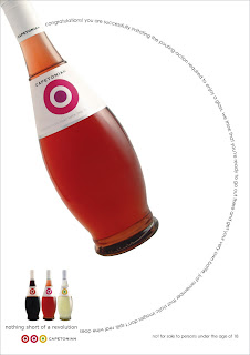
Nothing short of a Revolution

When you are given a brief to communicate the uniqueness of a product, you kind of have to shrug - especially if this product belongs to a category that is already so overwhelmed with me-too products!

Imagine this: a brand wine, shown on Bloubergstrand, strategically placed with Table Mountain in the background. The brand name and its logo was already decided, Capetonian Wines was set to stun the masses. All we needed was an apt pay-off line to communicate that it was unique.

BUT...

The logo, which was a replica of the Royal Air Force roundel, gave me an idea of a brand that is out to be individual - to stand out from the category. Was I the only one in the boardroom who could see the possibilities this brand offered? Well, I stated my case and we worked on my suggestion - to link the brand to the 60s Mod Movement.

Why? In Cape Town’s young professional market (which the brand aimed to target), the similarities to the 60s Mod Culture is undeniable. For instance, Mods had a self-conscious and critical attitude. They personalised existing styles and symbols (like the Royal Air Force roundel) in a pop art fashion. Elements that classified this group of hip youngsters, included their fashion sense (they often wore tailor-made suits), pop music that jumped cultural boundaries, and Italian motor scooters (like Vespa).

This sounds like Cape Town to me. And that is what I wanted to represent with this brand, a wine that is as unique as the Capetonians who purchase it.

The pay-off line, Nothing short of a Revolution, pays homage to the rebellious style of the Mods, while complimenting Cape Town’s cunning sense of individuality.