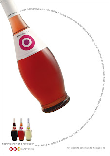
Imagine this: a brand wine, shown on Bloubergstrand, strategically placed with Table Mountain in the background. The brand name and its logo was already decided, Capetonian Wines was set to stun the masses. All we needed was an apt pay-off line to communicate that it was unique.
BUT...
The logo, which was a replica of the Royal Air Force roundel, gave me an idea of a brand that is out to be individual - to stand out from the category. Was I the only one in the boardroom who could see the possibilities this brand offered? Well, I stated my case and we worked on my suggestion - to link the brand to the 60s Mod Movement.
Why? In Cape Town’s young professional market (which the brand aimed to target), the similarities to the 60s Mod Culture is undeniable. For instance, Mods had a self-conscious and critical attitude. They personalised existing styles and symbols (like the Royal Air Force roundel) in a pop art fashion. Elements that classified this group of hip youngsters, included their fashion sense (they often wore tailor-made suits), pop music that jumped cultural boundaries, and Italian motor scooters (like Vespa).
This sounds like Cape Town to me. And that is what I wanted to represent with this brand, a wine that is as unique as the Capetonians who purchase it.
The pay-off line, Nothing short of a Revolution, pays homage to the rebellious style of the Mods, while complimenting Cape Town’s cunning sense of individuality.


No comments:
Post a Comment